
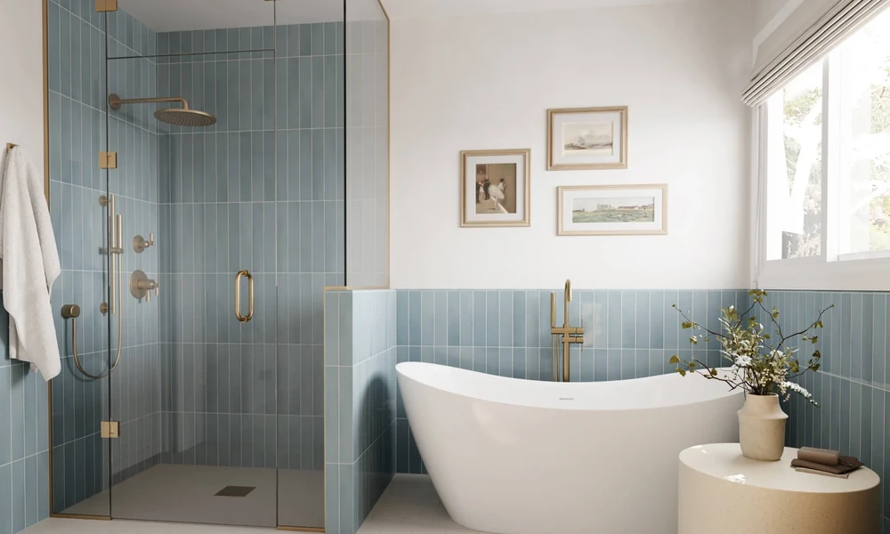
A single shift in wall tile color can make a cramped bathroom feel airy, or transform a bland living room into a dramatic escape. Color is not just a design choice, it’s an optical tool that shapes how we perceive the spaces we inhabit.
How Wall Tile Colors Shape Our Spatial Experience
Step into any room and your eyes immediately process color, brightness, and contrast. These subtle cues work together to trick the mind into sensing a space as larger, cozier, taller, or even more inviting than it really is. Wall tiles, with their large surface area and vertical orientation, have a unique power to amplify or minimize these effects.
The Psychology Behind Color and Space Perception
Colors carry psychological weight. Light shades, especially whites and soft neutrals, evoke openness and tranquility. Dark tones like charcoal or black add sophistication, but also compress. Bright colors inject energy and focus, drawing the eye instantly to a particular surface.
Why Wall Tiles Matter More Than Flooring
Floor color certainly plays a role, but wall tiles dominate our field of vision. Because walls are upright and meet the gaze head-on, their colors command more influence over our emotional and spatial reactions. The right tile color, finish, and placement can turn even a windowless box into an inviting environment.
Case Study 1: Light Colors Expanding Small Bathrooms
Small bathrooms often battle a sense of claustrophobia. Designers consistently reach for white, off-white, or pale grey wall tiles to visually “push” the walls outward.
Using White and Off-White Tiles to Create Airiness
High-reflective white tiles scatter available light, making even the dimmest bathroom feel brighter and more open. Off-white tones soften harshness, avoiding a clinical look while maintaining spaciousness.
Real-Life Example: Montreal Apartment Bathroom Transformation
A Montreal apartment bathroom measured just 5 by 7 feet. After installing large-format, off-white ceramic wall tiles, the change was remarkable. Natural and artificial light bounced around the room, and what once felt like a closet became a serene, open retreat.
Case Study 2: Dark Tiles Adding Depth and Drama
Dark-colored wall tiles can shrink a space if used indiscriminately, yet in the right setting, they deliver drama and depth. Picture a modern loft where slate-gray or black tiles climb the walls, creating a cocooning effect and a sense of intimacy.
Charcoal and Black Tiles in Modern Living Rooms
When paired with strong natural light and lighter furnishings, deep hues anchor the space, making it feel sophisticated without overwhelming. The key is balance: too much dark in a small, poorly lit room can stifle, but strategic placement elevates.
Impact on Room Ambiance and Perceived Size
Contrary to popular belief, dark tiles can make large rooms feel cozier, especially when used on accent walls. They draw the eye inward, shortening visual distance. The effect? An elegant, enveloping vibe rather than impersonal vastness.
Case Study 3: Bold Colors and Patterns for Focal Walls
Vivid blues, warm oranges, or intricate designer tiles are the secret weapon for those wanting to add personality without renovating an entire space.
Blue, Orange, and Designer Porcelain Tiles as Statement Pieces
A splash of blue on a shower wall or a burst of orange behind a kitchen counter instantly becomes a room’s focal point. Designer porcelain tiles, often found in collections like Club Ceramic Tiles, offer an incredible range of colors and patterns for this purpose.
How Feature Walls Alter Room Dynamics
A single accent wall draws attention, visually widening or heightening a room depending on placement. Patterns can elongate or compress a wall, subtly transforming the room’s proportions without moving a single piece of furniture.
The Role of Tile Finish and Texture in Color Perception
Color doesn’t operate in a vacuum; finish and texture modulate its impact.
Glossy vs Matt: Reflectivity and Light Interaction
Glossy tiles reflect more light, boosting the sense of spaciousness. In contrast, matt tiles absorb more light, lending a grounded, subtle feel. The choice can refine the mood and functionality of a given room.
Case Example: Glossy White Tiles in a Kitchen for Brightness
A kitchen with limited daylight benefits from high-gloss white wall tiles. The reflective surface amplifies every lumen, while a matt finish might feel flat and less vibrant.
Combining Colors and Sizes to Manipulate Space
Color is only part of the story. Tile size and placement can further enhance (or sabotage) spatial illusions.
Tile Size Effects: Large Formats vs Small Mosaic Tiles
Larger tiles reduce grout lines, creating seamless expanses that look less cluttered, ideal for opening up compact spaces. Small mosaic tiles, on the other hand, introduce texture and rhythm, which can energize a large, bland wall or add character to a niche.
Strategic Color Placement for Visual Flow
Pairing light-colored upper walls with darker lower tiles can visually heighten ceilings. Alternating colors or laying tiles in creative patterns can lead the eye where you want, subtly controlling how a space is traversed.
Practical Tips for Choosing Wall Tile Colors Based on Room Purpose
Selecting the right tile color is both an art and a science. For kitchens, prioritize brightness and stain resistance. Bathrooms thrive on serene, space-enhancing hues. Living rooms can handle bold feature walls or deeper tones, depending on the mood you want to foster.
Avoiding Common Mistakes with Color Selection
– Don’t default to white everywhere. It can feel cold without warmer accents.
– Beware of using dark tiles in shadowy, small rooms unless balanced by light or mirrors.
– Test tile samples in your actual space; colors shift with changing light.
Future Trends in Wall Tile Colors and Their Spatial Impact
Designers are increasingly embracing earthy greens, inky blues, and textured neutrals, often with layered finishes that play with light in surprising ways. Innovations in digital printing and tile manufacturing, as seen in collections like Club Ceramic Tiles, are making it easier to achieve custom looks that precisely suit your space goals.
Color, finish, and format together give you the power to manipulate space perception, no renovations required. If you use these tools thoughtfully, every room can tell its own story.